Landboard Brand Identity
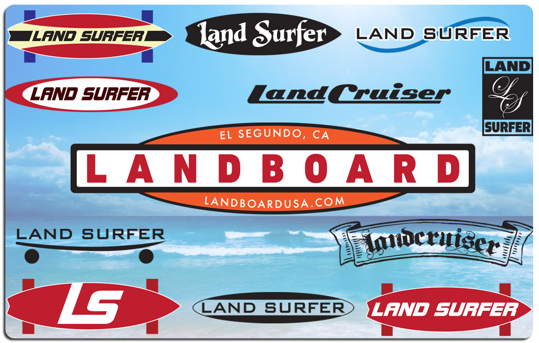
Landboard was a different kind of skateboard. Utilizing special “surfing style” trucks and large wheels, it not only simulated the feel of a surfboard on land, but also looked like one. The company wanted a logo that evoked an old school surf feel. Plus they had not yet settled on a name. In addition to logo and creative work, we provided the creative guidance throughout the process and in the end designed a logo they absolutely love.
This is another product where Modul8tion got in on the ground floor. The product was presented to us without so much as a name. There were several ideas for names and we contributed a few more. And in this stage, we began to concept logos and branding. Because the product evoked a retro, old school surf feel, it was agreed that the name and logo should also convey a retro, old school surf feel. So we turned on The Endless Summer, cranked up The Beach Boys and went to work. We weren’t looking for variations on the same logo, but very different styles from which to choose in order to arrive at the perfect fit for this innovative product. The final logo, while retro “surf city” in feel, was still modern and clean. The name and branding enhanced the product and the client was extremely happy.
Do you have a great product but don’t yet know what to call it? Perhaps you have a few names to choose from, but want to see some logo treatments before settling on one. Call Modul8tion for concepting and brainstorming. We will work with you to help you create the best brand for your product. We will not rest until you’re happy.

The Modul8tion Group